15+ Wireframe Examples To Inspire Your Next Design
Wireframes are an essential tool in the design process, providing a visual guide for website and app layouts. They act as a blueprint, conveying the structure and functionality of a digital product before any detailed design or development work begins.

Wireframes are an essential tool in the design process, providing a visual guide for website and app layouts. They act as a blueprint, conveying the structure and functionality of a digital product before any detailed design or development work begins.
Creating wireframes allows design teams to iterate and refine ideas, ensuring a seamless user experience.
There are various types of wireframes, including low-fidelity and high-fidelity options.
Low-fidelity wireframes are basic representations of a layout, typically created during the ideation process. They focus on the overall structure and content placement, allowing designers to quickly explore different design ideas.
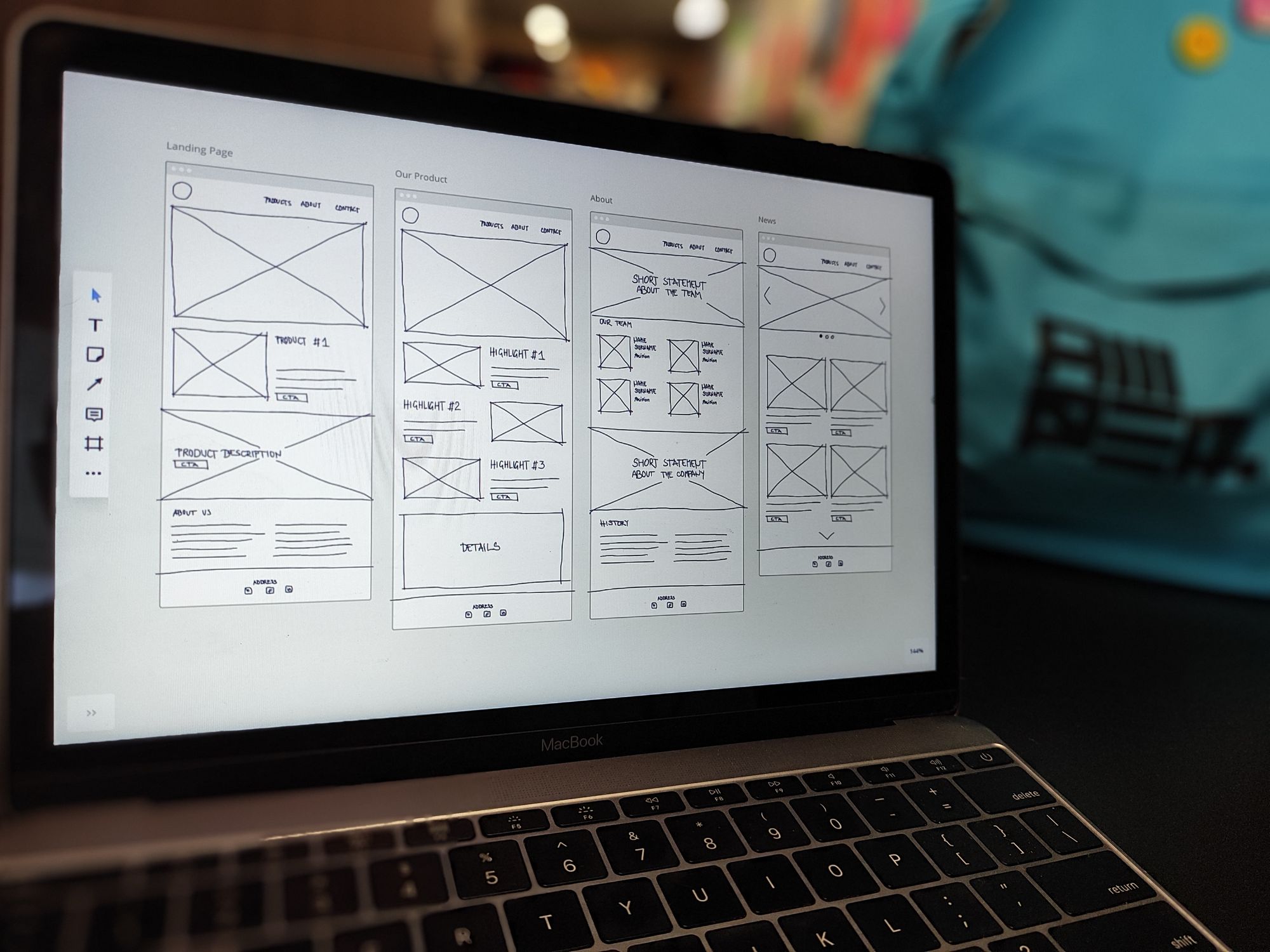
High-fidelity wireframes, on the other hand, provide more detailed designs with visual elements and interactive elements, showcasing the user journey and potential functionality.
To create a wireframe, start by defining the objectives and key features of your digital product. Then, consider the target audience and their needs. From there, you can choose the appropriate wireframing tools such as Sketch, Figma, or Adobe XD.
Begin by sketching out the basic layout, focusing on the arrangement of essential elements such as headers, navigation menus, and content placeholders.
- What Is A wireframe?
- Why Is Wireframing Important?
- How To Create A Wireframe
- 1. Clarify Your Business Objectives
- 2. Determine Your Website's Primary Function
- 3. Start Hand-Sketching Simple Wireframes
- 4. Start Increasing The Resolution Of Your Wireframe
- 5. Produce A Final Wireframe Mockup
- Wireframe Mockups And Website Examples
- 6. Service-Based Business Wireframe
- 7. SAAS Website Wireframe
- 8. Mobile Consulting Wireframe
- 9. Fashion And Beauty Website Wireframe
- 10. Bold eCommerce Website Wireframe
- 11. Interactive Mobile Wireframe
- What To Include In A Website Wireframe
- 12. Build A Wireframe To Suit Your Website Function
- 13. Plan Out Your User Flows
- 14. Plan Out Your Content Hierarchy
- 15. Use Grids, Templates, And UI Kits
- 16. Use Fewer Images, Lazy-Loading, And Optimize Your Final Website
- Start Wireframing!
What Is A Wireframe?
A wireframe is a visual representation or blueprint of a website or app design that outlines its basic structure, content placement, and interface elements. It provides a simplified view of the design, focusing on the layout and navigation rather than the visual design details.
The purpose of wireframes is to define the structure and functionality of a digital product before moving on to the detailed visual design phase.
They allow designers and stakeholders to visualize and understand the user journey, information hierarchy, and overall flow of the website or app. By removing distractions of color, typography, and graphic design, wireframes enable the focus to be on the core elements and user experience.
Wireframes play a crucial role in the design process as they help in identifying potential usability issues, streamlining navigation, and testing different layouts.
They serve as a visual guide for designers to collaborate with other team members, including developers, content creators, and clients, ensuring everyone is aligned with the overall vision and objectives of the project.
Why Is Wireframing Important?
Wireframing is an important step in the design process as it helps define the structure and functionality of a digital product. By creating a visual blueprint of the website or app, wireframes provide a clear and organized representation of key elements and user flow.
One of the benefits of wireframing is that it separates design from user experience (UX). By focusing on the core elements and overall flow without distractions of color or typography, wireframes allow designers to prioritize usability and functionality. This ensures that the user's needs are met before moving on to the visual design phase.
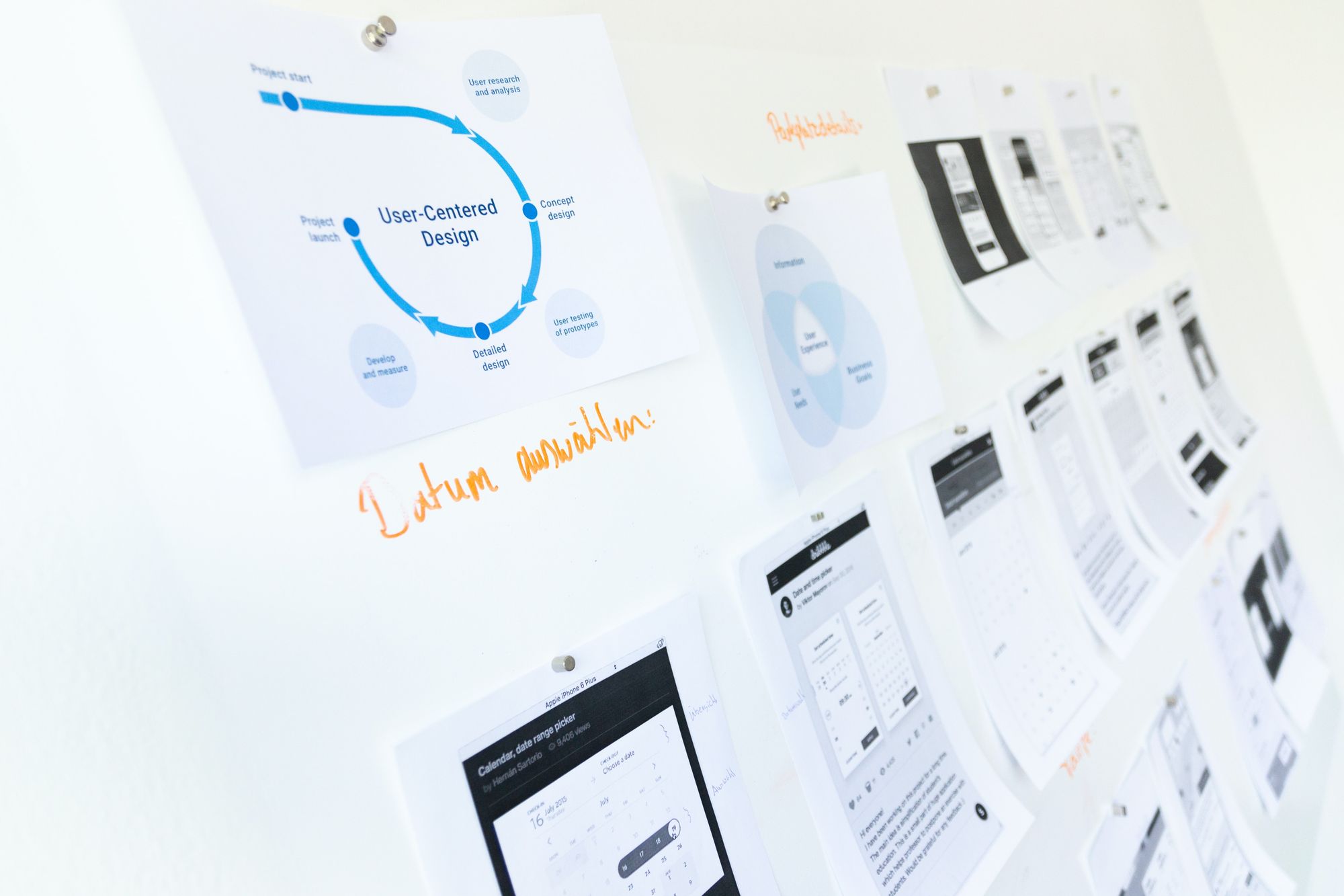
Wireframes also play a crucial role in involving clients early on in the design process.
By presenting wireframes, clients can visualize the product's structure and provide feedback.
This early collaboration helps align their expectations with the design team and ensures that the project is heading in the right direction, saving time and preventing major revisions later on.
How To Create A Wireframe
To create an effective wireframe, it is important to start with a clear understanding of the goals and objectives of the project. This involves conducting thorough research and gathering requirements from stakeholders and potential customers.
By understanding the target audience and their needs, designers can ensure that the wireframe addresses their pain points and provides a solution that meets their expectations.
Once the goals and requirements are established, it's time to start sketching the wireframe. This can be done using pen and paper or with the help of wireframing tools. The focus should be on creating a low-fidelity wireframe that captures the basic elements and flow of the design. This helps in quickly iterating and making changes based on feedback.
As the wireframe progresses, it's important to consider the user journey and flow. This involves mapping out the different screens and interactions that a user will go through to accomplish their tasks. By visualizing the user experience, designers can identify any bottlenecks or usability issues and make necessary adjustments.
Throughout the wireframing process, it's important to keep the design team and stakeholders involved. Regular communication and feedback sessions help in ensuring that everyone's expectations are aligned and that the wireframe is meeting the project goals.
1. Clarify Your Business Objectives
This step sets the foundation for the entire design process and ensures that the wireframe aligns with your overall goals. By clearly defining your business objectives, you can create a wireframe that focuses on key features and functionalities that will drive your success.
One of the main benefits of clarifying your business objectives is that it helps you prioritize your design decisions. Understanding what you want to achieve with your website allows you to identify the essential elements that need to be included in the wireframe. This prevents you from getting bogged down with unnecessary features that may distract or confuse your users.
Moreover, clarifying your business objectives enables you to cater the wireframe to your target audience.
By knowing who your audience is and what they expect from your website, you can design a wireframe that meets their needs and provides a seamless user experience. This user-centric approach ensures that your wireframe aligns with your customers' expectations, leading to higher engagement and conversions.
2. Determine Your Website's Primary Function
Starting to design a website means really understanding how it fits into your overall business plan. One cannot stress enough the importance of pinpointing your website's primary function. This step lays the foundation for all subsequent content, design aesthetics, and user interface decisions.
A clear vision ensures that you don't deviate from your business objectives or lose sight of what you hope to accomplish with your online presence.
By focusing on your website's specific purpose or function, you allow it to be more than just a digital business card. Content-rich platforms like blogs become essential if you're hoping to become a trusted authority in a specific niche.
Conversely, a news-centric model with features like trending articles and instant updates becomes vital if your mission revolves around disseminating timely information. Or, if commerce drives your web ambitions, the emphasis should then shift towards designing a seamless, user-friendly shopping experience.
It's essential to recognize these nuances, for they determine the primary architecture and flow of your website.
The initial stages of design, characterized by wireframing, are not just about aesthetic appeal but are deeply rooted in function and user experience.
Wireframes act as the blueprint that architects the user's journey on your site, ensuring every click, scroll, or interaction is purposeful and aligned with your objectives. It's a foresight tool that allows you to eliminate potential design and functionality barriers that might hinder the user experience.
By committing to this process, you're safeguarding your resources and ensuring that your website resonates with its intended audience and purpose.
3. Start Hand-Sketching Simple Wireframes
When starting the wireframing process, sometimes the most effective way to brainstorm and iterate quickly is by hand-sketching simple wireframes. This low-fidelity approach allows you to work fast and keep things simple, focusing on the basic layout and structure without getting distracted by high-resolution details.
To begin, grab a piece of paper or use a whiteboard and start sketching your ideas using rough, low-resolution blocks. Don't worry about adding text or images at this stage. The goal is to rapidly visualize different layout ideas and eliminate ones that don't work.

A useful technique is to fold a piece of letter paper into eighths. Each fold represents a different section of your wireframe, allowing you to explore various design configurations quickly. This way, you can test out multiple concepts in a short amount of time and identify the most promising ideas.
Remember to focus on the overall layout and functionality rather than getting caught up in the visual details. By keeping your wireframes low-resolution, you can iterate faster and make changes on the fly without investing too much time in intricate elements.
Hand-sketching simple wireframes is a quick and efficient way to explore design possibilities and refine your ideas before moving to digital prototyping. It provides a visual guide for your design process, allowing you to experiment, iterate, and ultimately create wireframes that effectively communicate your vision.
4. Start Increasing The Resolution Of Your Wireframe
Once you have sketched out your low-fidelity wireframe on paper or a whiteboard, it's time to increase the resolution and add more detail. Mapping out your wireframe on a digital platform like Miro can help you create a more refined version of your initial concept.
To start, lay out your wireframe according to specific dimensions, with a focus on mobile first. Consider the size of logos, headers, and images, and think about the user flow and whether it aligns with the goals of your website or app.
Increasing the resolution of your wireframe allows you to add more specific details and refine the visual elements. This can include adding content placeholders, incorporating actual text, and refining the overall visual design.
By considering the user flow and functionality from the start, you can ensure that your wireframe is aligned with the goals of your design project.
Remember to keep the wireframe flexible and iterative, allowing room for changes and improvements as you progress through the design process. With a higher-resolution wireframe, you can collaborate more effectively with your design team, make more informed decisions, and ultimately create a wireframe that accurately represents your design ideas.
5. Produce A Final Wireframe Mockup
Producing a final wireframe mockup is a crucial stage in the design process as it allows designers to refine their initial design ideas and craft a more detailed representation of the website or app.
This high-fidelity wireframe not only aids in visually showcasing the layout and interactive elements but also serves as a visual guide for the development team.
When creating the final wireframe mockup, it is important to consider the layout in relation to the website's primary function and how it contributes to the overall business goals.

The wireframe should be structured to prioritize key features and important content, ensuring that users can easily navigate and accomplish their goals on the website or app.
Critical evaluation plays a significant role in this stage, as designers need to review and assess the wireframe to eliminate any redundant design decisions that may hinder the user experience.
This involves evaluating the placement of interactive elements, the coherence of the user flow, and the overall visual design. By critically evaluating the wireframe, designers can identify areas that need improvement and optimize the user experience.
Wireframe Mockups And Website Examples
Wireframes can vary in fidelity, with low-fidelity wireframes representing a basic design structure and high-fidelity wireframes showcasing more detailed design and real content.
Examples of wireframes can include a weather app wireframe, a dashboard wireframe, or mobile screens for different user journeys. These wireframes help designers and product teams collaborate and iterate on design ideas, ensuring that the final product meets the needs and expectations of potential customers.
Several wireframing tools and templates are available to assist in the wireframing process, such as wireframe kits or interactive wireframe examples.
Whether created from scratch or based on existing designs, wireframes are integral to the design process, facilitating efficient communication and enhancing the user experience.
6. Service-Based Business Wireframe
One example of a service-based business wireframe can be seen in the work by Bud Thomas for Focus Lab on Dribbble. Thomas showcases the power of a well-designed wireframe by providing subtle differences in information placement and variations in homepage options.
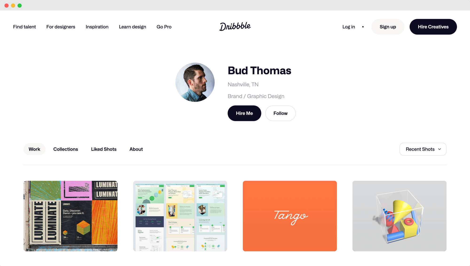
The wireframe serves as a visual guide for the design process, allowing the design team to explore different layout options before diving into the detailed design.
In another wireframe example, Masadur Rahman demonstrates the importance of simplicity and whitespace in a wireframe design for a catering service. The wireframe features a clean and minimalistic layout, allowing the content to breathe and creating a visually pleasing experience for the user.
Rahman uses different colors to separate screens with different information, making it easy for potential customers to navigate and find the relevant details they need.
Additionally, the wireframe provides accessibility through a simple navigation bar, ensuring that users can easily explore the website's different sections.
These service-based business wireframes highlight the various elements and considerations that go into creating an effective wireframe.
From variations in homepage options to the strategic use of whitespace and color, these wireframes serve as essential tools in the ideation process for design projects. They provide a basic layout and outline the key features and interactive elements, enabling the design team to create high-fidelity wireframes and interactive prototypes that deliver an exceptional user experience.
7. Saas Website Wireframe
The SAAS website wireframe example taken from Flowbase on Dribbble showcases an impressive design that effectively communicates the features and benefits of the service. The wireframe utilizes a clean and minimalistic layout, with clear sections and a well-defined hierarchy of information.
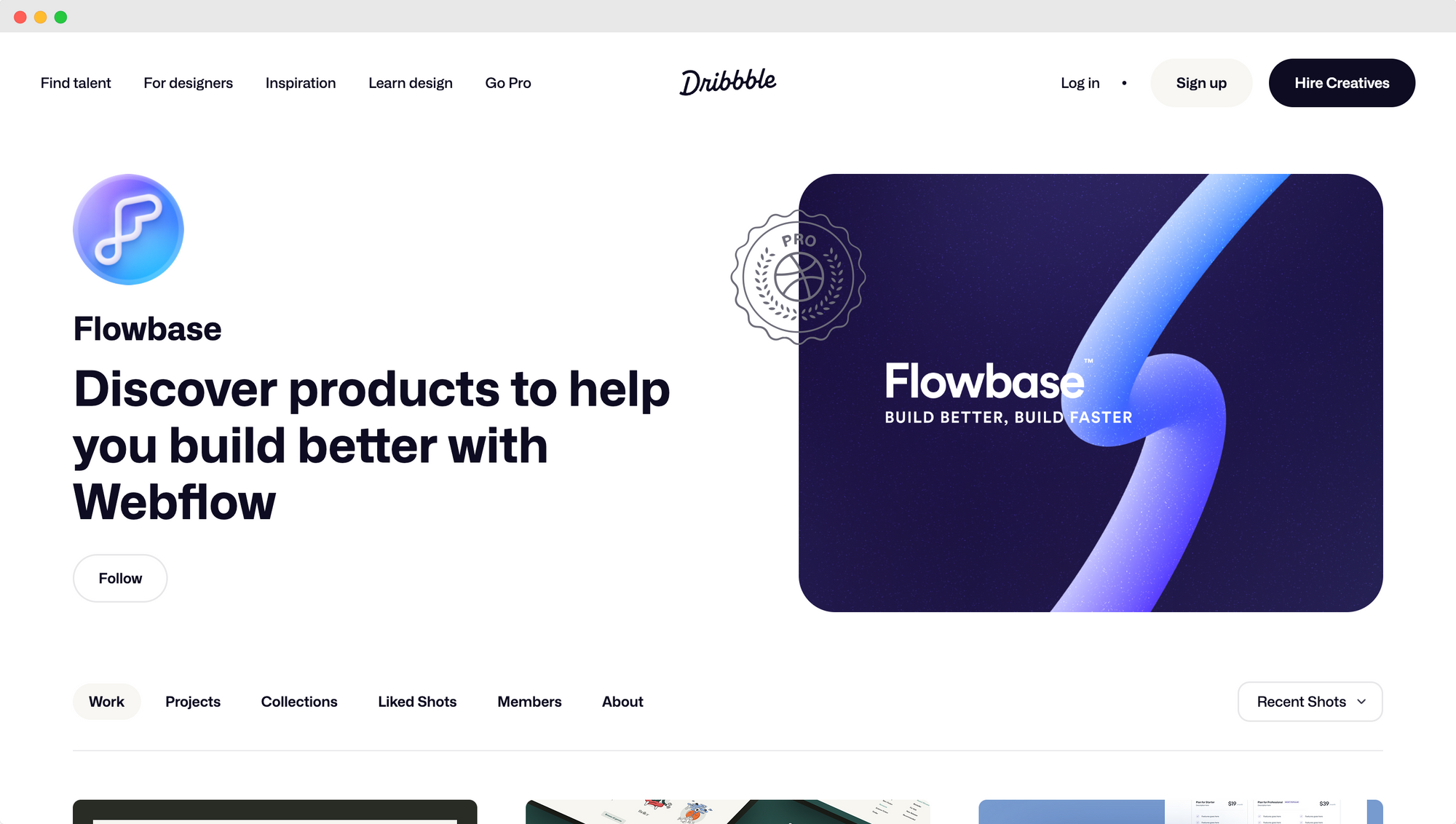
One notable feature of this wireframe is the placement of social proof elements above the fold. This includes customer testimonials and impressive facts about the service. By placing these elements prominently on the page, the wireframe aims to build trust and credibility with visitors immediately.
The wireframe also effectively utilizes visual elements to highlight key features and functionalities.
Icons and descriptive text are strategically placed to convey the value proposition of the SAAS product at a glance.
In terms of usability, the wireframe employs a clear and intuitive navigation menu, allowing visitors to explore the website's different sections easily. Additionally, the content organization and placement of call-to-action buttons throughout the wireframe help to guide users toward conversion points.
8. Mobile Consulting Wireframe
The mobile consulting wireframe example from BB Agency on Dribbble showcases several key features and design elements that contribute to its effectiveness and usability.
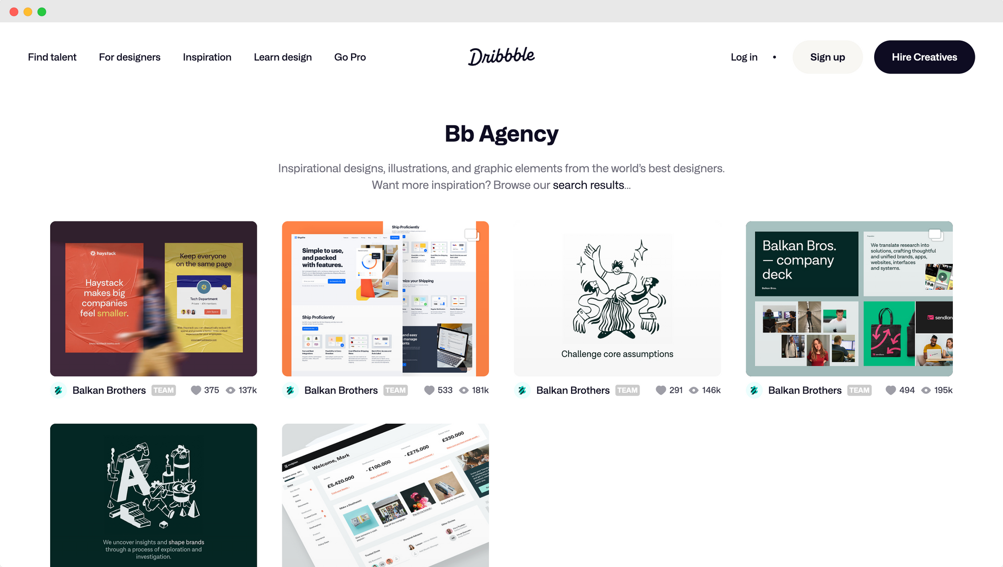
One notable feature of this wireframe is the clear and streamlined structure of the app. The wireframe lays out the different sections and functionality in a logical and easy-to-navigate manner. This allows users to quickly find what they are looking for and efficiently browse through the app's offerings.
In terms of design elements, the wireframe incorporates a clean and minimalist aesthetic. It uses a simple color palette, typography, and iconography to create a visually appealing and user-friendly interface.
Using whitespace helps separate different sections and content, enhancing readability and focus.
Furthermore, the wireframe emphasizes the automation of the logistics delivery flow. It incorporates features and elements such as order tracking, delivery notifications, and real-time updates to provide a seamless and efficient user experience.
By focusing on automating the logistics process, the wireframe aims to improve convenience and productivity for both the users and the service providers.
9. Fashion And Beauty Website Wireframe
One example of a fashion and beauty website wireframe is the design by Farzan Farouk on Dribbble. This wireframe showcases a modern and sleek aesthetic with a focus on visual elements.
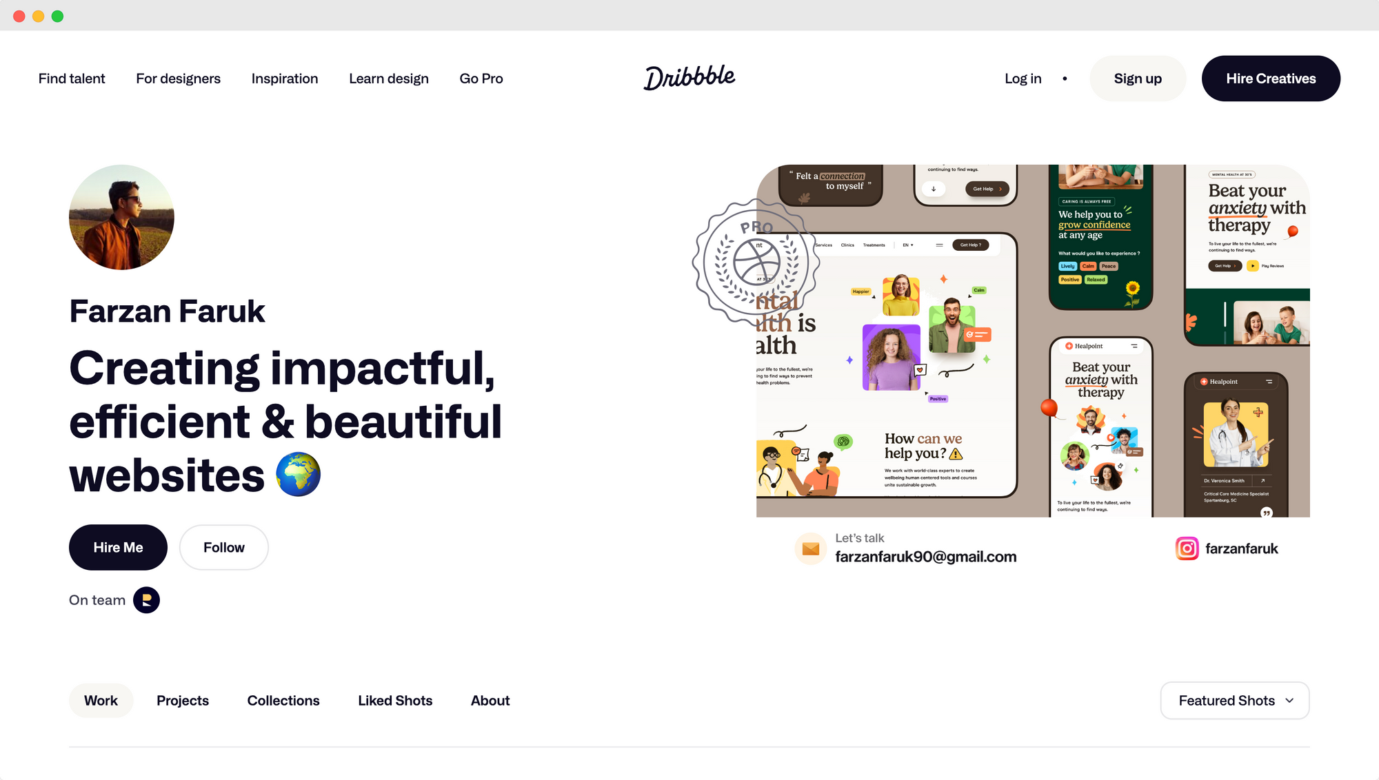
The wireframe incorporates large, high-resolution images to showcase products and create a visually appealing interface.
Dynamic text sections allow for flexibility in displaying product details, prices, and descriptions.
Additionally, the wireframe includes interactive elements such as dropdown menus and hover effects, providing users with an engaging browsing experience. The clean and minimalist design ensures that the focus remains on the products and allows for easy navigation.
Another example is the beauty app wireframe by Ricardo Arroyo. This wireframe is specifically designed for a beauty app, showcasing a range of beauty products and services.
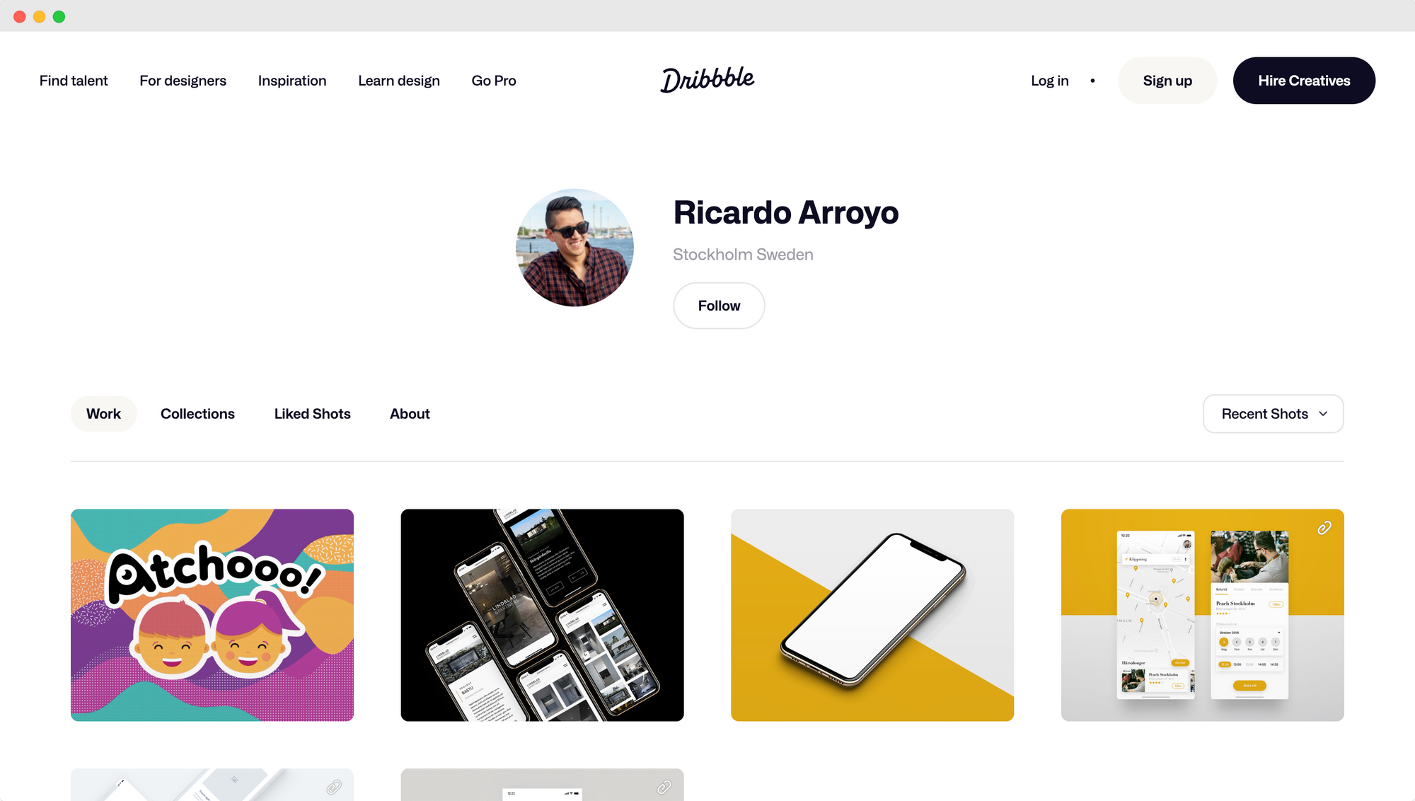
The wireframe incorporates a feminine and elegant design with soft colors, curved lines, and delicate typography. It includes features such as personalized recommendations based on user preferences, skincare quizzes, and booking appointments.
The wireframe also showcases social media integration, allowing users to share their favorite products or looks on platforms like Instagram and Pinterest. The inclusion of user reviews and ratings adds credibility to the app and helps users make informed decisions.
10. Bold Ecommerce Website Wireframe
A bold eCommerce website wireframe is a standout example of a wireframe specifically designed for an online store. This type of wireframe uses vibrant brand colors and bold visuals to create a strong and memorable presence while still maintaining a simple layout with ample white space.
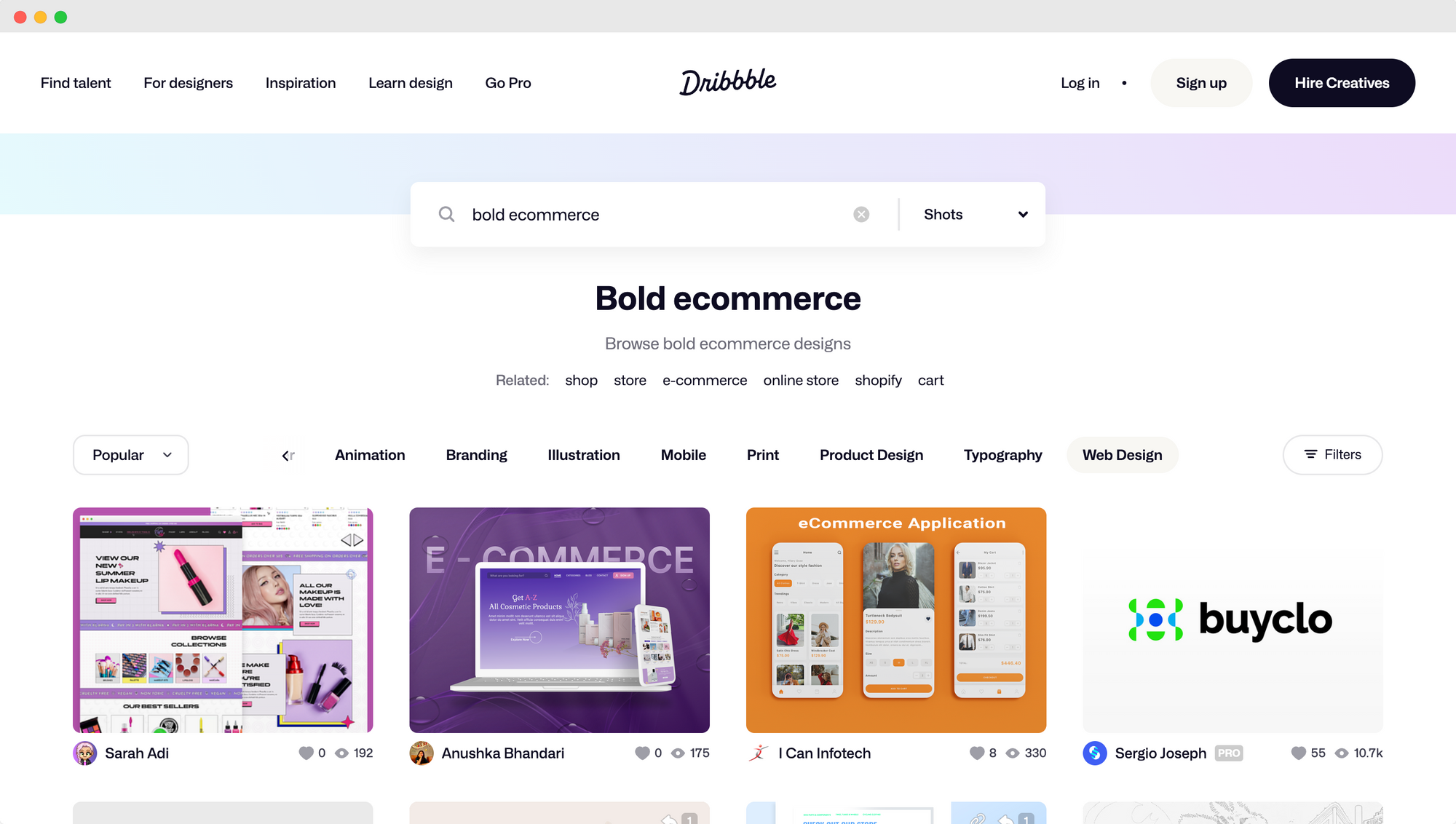
The wireframe showcases the key elements and features important for an eCommerce website, such as a prominent search bar, clear navigation menus, and product categories.
It also includes featured products, new arrivals, and sales sections, effectively highlighting promotional items and encouraging potential customers to purchase.
One of the potential capabilities of this wireframe is the ability to provide personalized recommendations based on user preferences and past purchases. The wireframe can generate tailored product suggestions that increase engagement and drive sales by capturing user data and analyzing buying patterns.
11. Interactive Mobile Wireframe
Figma prototyping is an incredibly useful tool when creating an interactive mobile wireframe. Figma allows designers to create static wireframes and add interactive elements to simulate user interactions.
When wireframing mobile apps, it's important to focus on structure before aesthetics. The wireframe should outline the flow and functionality of the app, ensuring that all necessary features and content are included. This helps identify potential usability issues or missing elements early in the design process.
To create an interactive mobile wireframe in Figma, start by building the basic layout of the app's screens using the design tools. Once the structure is in place, use Figma's prototyping feature to add interactive elements. This can include tap interactions, swipe gestures, and scrollable areas to simulate how the app will function.
It's crucial to keep animated transitions simple and purposeful when adding them.
While adding animation can enhance the user experience and provide feedback, too many complex animations can distract from the main purpose of the wireframe, which is to convey the app's functionality and flow.
What To Include In A Website Wireframe
When creating a wireframe for a website, it's important to consider the key elements that should be included to ensure a successful design.
A website wireframe serves as a blueprint for the overall structure and layout of the site, providing a visual representation of its functionality and content placement.
This essential step in the design process helps to establish the hierarchy and organization of information and determine the placement of elements such as navigation menus, images, text, forms, and interactive features.
Additionally, it allows for early testing and feedback, facilitating effective communication between stakeholders and the design team. By including all necessary design elements in the wireframe, designers can ensure that the final website meets the goals and objectives of the project, delivering a seamless user experience.
12. Build A Wireframe To Suit Your Website Function
Understanding the primary function of your website is key in the wireframing process, as it helps you create a layout and structure that best supports that function.
Consider the key features and elements that are necessary to fulfill the primary function of your website.
For example, if you have an e-commerce website, you'll need to include sections for product listings, shopping carts, and payment gateways. If your website is focused on providing information, you must prioritize content organization and navigation.
-2.png#keepProtocol)
Think about the user experience you want to create. How should users navigate through your website? What actions do you want them to take? Incorporate these aspects into your wireframe to ensure a smooth and intuitive user journey.
Remember, wireframes are meant to be a visual guide rather than a detailed design. Focus on basic layout and functionality, keeping it simple and easy to understand. You can always add more detailed elements later in the design process.
By building a wireframe that aligns with the function of your website, you'll be able to effectively communicate your website objectives and create an intuitive user experience for your potential customers.
13. Plan Out Your User Flows
Are you trying to inform, sell, entertain, or engage? Pinning down these objectives helps guide your decisions in the later stages, ensuring that every element serves a deliberate function and aligns with the overarching goals.
Once you've anchored your design with a clear purpose, it's time to visualize the user's journey. This involves picturing the myriad of paths a user might traverse within your platform. Whether they're searching for information, making a purchase, or simply exploring, these journeys can be intricate and varied.
By mapping out these potential routes, designers can anticipate areas where users might face confusion or frustration and preemptively smooth out these pain points.
Moreover, every touchpoint—a button click, form entry, or page transition—needs to be scrutinized for efficiency and intuitiveness. A deep dive into these interactions ensures that users don't just visit, but they also enjoy a seamless and intuitive experience.
Before a wireframe's actual drawing or digital rendering commences, laying out user flows in a straightforward, text-based format can be invaluable. This involves listing down main screens or pages and illustrating how one leads to another, perhaps using simple arrows or connectors.
Accompanied by concise descriptions of user actions or decisions, this method serves as a narrative of the user’s journey. It provides a structured, easy-to-follow guide, making the subsequent process of sketching wireframes more organized and effective.
Remember, a well-thought-out user flow translates to a user-friendly website or application. Ensuring your wireframes capture these flows means you're laying the foundation for a positive user experience.
14. Plan Out Your Content Hierarchy
When wireframing a website or application, one crucial aspect to consider is planning out the content hierarchy. Content hierarchy refers to the organization and prioritization of information displayed on each page or screen. It plays a vital role in ensuring a clear and intuitive user experience.
The first step in planning the content hierarchy is to understand the goals of the website or application. By identifying the key objectives, you can determine the most important information that needs to be prominently displayed. This information should be prioritized in the content hierarchy, ensuring it is easily accessible to users.
Information prioritization is also influenced by the target audience and their needs. By understanding who the potential users are and what they are looking for, you can structure the content in a way that meets their expectations and reduces cognitive load.
By organizing the content in a logical and intuitive manner, users can quickly find what they are looking for without feeling overwhelmed or confused.
An effective visual hierarchy is essential in wireframing to guide users' attention to the most important information. By using visual cues such as size, color, and placement, you can create a clear visual hierarchy that directs users' focus and prevents a cluttered and confusing user experience.
Ultimately, planning out the content hierarchy in wireframing is essential for creating a user-friendly and engaging experience. It ensures that the most important information is easily accessible, reduces cognitive load, and guides users to the content they need.
By prioritizing information and using effective visual hierarchy, you can create wireframes that effectively communicate your website or application's goals to users.
15.Use Grids, Templates, And Ui Kits
When it comes to wireframing, leveraging grids, templates, and UI kits can significantly enhance the design process. Grids provide a structured framework that helps in organizing content placeholders. They ensure a balanced use of space and create a visually pleasing layout.
Wireframe templates are pre-designed layouts that can be customized to meet specific project needs. These templates offer a starting point, saving time and effort in creating wireframes from scratch. They provide a consistent structure and layout, making it easier to visualize the final design.

UI kits, on the other hand, offer a wide range of ready-made screens, design elements, and interactive components. These kits expedite the wireframing process as they provide a library of commonly used design elements, such as buttons, icons, and form fields.
They allow designers to quickly prototype different screens and user flows, speeding up project development.
The benefits of using grids, templates, and UI kits in wireframing are immense. They provide a visual guide and a solid foundation for the design process. Additionally, they offer easy customization and scalability, ensuring that wireframes can adapt to different screen sizes and design requirements.
To summarize, leveraging grids, templates, and UI kits in wireframing simplifies the process, enhances efficiency, and promotes consistency in design. It allows designers to focus on the creative aspects of the project rather than starting from scratch.
16.Use Fewer Images, Lazy-Loading, And Optimize Your Final Website
Use fewer images, implement lazy-loading, and optimize your final website to improve its performance and enhance user experience.
Having fewer images on your website can significantly improve loading speed. Each image requires time to download, which can slow down the overall website performance. Using fewer images reduces the amount of data that needs to be fetched, resulting in faster loading times.

Lazy-loading is another technique that can speed up your website. With lazy-loading, images are loaded only when they are in the viewport or about to be visible to the user. This means that images not immediately visible do not need to be loaded, reducing the initial loading time. Lazy-loading can greatly improve performance, especially on websites with a lot of images or long-scrolling pages.
Optimizing your final website is crucial for both performance and search engine rankings.
A slow website can lead to higher bounce rates, negatively impacting user experience and engagement. Additionally, search engines like Google take website speed into account when determining search rankings.
To optimize images, make sure they are in the appropriate format (JPEG for photographs, PNG for graphics), compressed to reduce file size, and properly resized to fit the display size. Implement lazy-loading using JavaScript libraries or built-in browser features to only load images as they become visible.
Start Wireframing!
Wireframing is the foundational step in the digital design process, providing a skeletal framework of a website or application. It’s a visual representation that outlines the structure, functionality, and flow without getting bogged down in intricate design details, much like an architect's blueprint for a building.
Why is this step so crucial? Wireframing allows for clear communication between team members, ensuring everyone is aligned on the project's goals and requirements.
It serves as a roadmap, guiding the development process and eliminating potential pitfalls by allowing for early feedback and revisions. Before diving deep into the aesthetics or coding, a wireframe ensures that the fundamental structures are sound, saving time, effort, and resources in the long run.


